骨架屏动画实现

Facebook首页加载动画如何实现

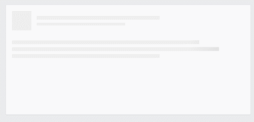
Facebook首页,鼠标滚动到底,实时加载新动态,加载过程会是下面的动态效果。这种效果不是gif图,而是CSS动画实现:

动态效果图片

HTML:

1
2
3
4
5
6
7
8
9
10
11
12
13
14
15
16
17
18
19
<div class="timeline-wrapper">
<div class="timeline-item">
<div class="animated-background">
<div class="background-masker header-top"></div>
<div class="background-masker header-left"></div>
<div class="background-masker header-right"></div>
<div class="background-masker header-bottom"></div>
<div class="background-masker subheader-left"></div>
<div class="background-masker subheader-right"></div>
<div class="background-masker subheader-bottom"></div>
<div class="background-masker content-top"></div>
<div class="background-masker content-first-end"></div>
<div class="background-masker content-second-line"></div>
<div class="background-masker content-second-end"></div>
<div class="background-masker content-third-line"></div>
<div class="background-masker content-third-end"></div>
</div>
</div>
</div>

外部容器: 最外面是包裹这段动画的居中div容器:

1
2
3
4
5
6
7
8
9
10
11
.timeline-item {
background: #fff;
border: 1px solid;
border-color: #e5e6e9 #dfe0e4 #d0d1d5;
border-radius: 3px;
padding: 12px;

margin: 0 auto;
max-width: 472px;
min-height: 200px;
}

动态背景:接下来实现动态背景效果,使用 CSS animation 和背景渐变 linear-gradient:

1
2
3
4
5
6
7
8
9
10
11
12
13
14
15
16
17
18
19
20
21
@keyframes placeHolderShimmer{
0%{
background-position: -468px 0
}
100%{
background-position: 468px 0
}
}

.animated-background {
animation-duration: 1s;
animation-fill-mode: forwards;
animation-iteration-count: infinite;
animation-name: placeHolderShimmer;
animation-timing-function: linear;
background: #f6f7f8;
background: linear-gradient(to right, #eeeeee 8%, #dddddd 18%, #eeeeee 33%);
background-size: 800px 104px;
height: 96px;
position: relative;
}

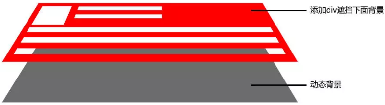
添加大量阻挡住背景的div:到现在效果看起来,就像一个巨大的进度条。我们添加大量的div,用来遮挡下面的背景动态效果:

1
2
3
4
5
6
7
8
9
10
11
12
13
14
15
16
17
18
19
20
21
22
23
24
25
26
27
28
29
30
31
32
33
34
35
36
37
38
39
40
41
42
43
44
45
46
47
48
49
50
51
52
53
54
55
56
57
58
59
60
61
62
63
64
65
66
67
68
69
70
71
72
73
74
75
76
77
78
79
80
81
82
83
84
85
86
87
88
89
90
91
92
93
94
95
96
97
.background-masker {
background: #fff;
position: absolute;
}

/* Every thing below this is just positioning */

.background-masker.header-top,
.background-masker.header-bottom,
.background-masker.subheader-bottom {
top: 0;
left: 40px;
right: 0;
height: 10px;
}

.background-masker.header-left,
.background-masker.subheader-left,
.background-masker.header-right,
.background-masker.subheader-right {
top: 10px;
left: 40px;
height: 8px;
width: 10px;
}

.background-masker.header-bottom {
top: 18px;
height: 6px;
}

.background-masker.subheader-left,
.background-masker.subheader-right {
top: 24px;
height: 6px;
}


.background-masker.header-right,
.background-masker.subheader-right {
width: auto;
left: 300px;
right: 0;
}

.background-masker.subheader-right {
left: 230px;
}

.background-masker.subheader-bottom {
top: 30px;
height: 10px;
}

.background-masker.content-top,
.background-masker.content-second-line,
.background-masker.content-third-line,
.background-masker.content-second-end,
.background-masker.content-third-end,
.background-masker.content-first-end {
top: 40px;
left: 0;
right: 0;
height: 6px;
}

.background-masker.content-top {
height:20px;
}

.background-masker.content-first-end,
.background-masker.content-second-end,
.background-masker.content-third-end{
width: auto;
left: 380px;
right: 0;
top: 60px;
height: 8px;
}

.background-masker.content-second-line {
top: 68px;
}

.background-masker.content-second-end {
left: 420px;
top: 74px;
}

.background-masker.content-third-line {
top: 82px;
}

.background-masker.content-third-end {
left: 300px;
top: 88px;
}

结构分析:

结构分析图片

vant 骨架屏动画如何实现

vant 骨架的动画和facebook的实现原理是一样的,只是动画只采用了修改整个容器的透明度 opacity, 所以动画实现更简单,不需要大量 html 元素和 css, 完整代码如下

1
2
3
4
5
6
7
8
9
10
11
12
13
14
15
16
17
18
19
20
21
22
23
24
25
26
27
28
29
30
31
32
33
34
35
36
37
38
39
40
41
42
43
44
45
46
47
48
49
50
51
52
53
54
<!DOCTYPE html>
<html>
<head>
<meta charset="UTF-8">
<title></title>
<style>
@keyframes van-skeleton-blink {
from {
opacity: 0.6;
}
to {
opacity: 1
}
}
.van-skeleton{
display: flex;
display: -webkit-flex;
display: -webkit-box;
padding: 0 16px;
}
.van-skeleton--animate{
animation: van-skeleton-blink 1.2s ease-in-out infinite;
-webkit-animation: van-skeleton-blink 1.2s ease-in-out infinite;
}
.van-skeleton__content{
width: 100%;
}
.van-skeleton__row, .van-skeleton__title{
height: 16px;
background-color: #f2f3f5;
}
.van-skeleton__title{
margin: 0;
}
.van-skeleton__title + .van-skeleton__row{
margin-top: 20px;
}
.van-skeleton__row{
margin-top: 12px;
}
</style>
</head>
<body>
<div class="timeline-wrapper">
<div class="van-skeleton van-skeleton--animate">
<div class="van-skeleton__content">
<h3 class="van-skeleton__title" style="width: 40%;"></h3>
<div class="van-skeleton__row" style="width: 100%;"></div>
<div class="van-skeleton__row" style="width: 60%;"></div>
</div>
</div>
</body>
</html>